If you spend even five minutes scrolling through tech Twitter or LinkedIn, you’ll find dozens of tools claiming to be the absolute “holy grail” of visual creation. They all promise to turn your wildest text prompts into agency-grade designs in seconds. But let’s be honest: most of them are just wrappers or overhyped toys that fall apart the moment you ask them to render a simple sentence or maintain a consistent brand identity.
I got tired of the marketing fluff. To find out which of the self-proclaimed best AI tools for graphic design actually live up to their hype, I put them through a brutal, side-by-side creative battle. No cherry-picked gallery examples, no theoretical benchmarks—just real-world design challenges to see which tool gets your actual work done the fastest.
In this multi-part deep dive, we are pitting three heavyweight models against each other: OpenAI’s brand-new GPT Image 2, Google’s fresh Nano Banana 2, and xAI’s flagship Grok Imagine. To keep the playing field perfectly level, I ran all of them inside a single unified platform. Here is exactly how they stacked up in round one.
The Contenders: Pitting the Best AI Tools for Graphic Design Against Each Other
Before we look at the canvas, let’s meet our three rivals. These aren’t just minor updates; they represent the absolute cutting edge of image generation and text-to-image technology heading into 2026.

The three major contenders ready for a head-to-head design battle.
- GPT Image 2 (OpenAI): OpenAI’s latest leap forward, engineered specifically to handle complex layouts, spatial awareness, and incredibly sharp typography rendering.
- Nano Banana 2 (Google): Google’s highly optimized, lightning-fast model designed to balance aesthetic cleanliness with rapid generation speeds.
- Grok Imagine (xAI): The flagship creative model powering Twitter/X, known for its raw realism, gritty detail, and aggressive adherence to prompt instructions.
When you’re searching for the best AI tools for graphic design, consistency is the ultimate metric. Can these models take a single product concept and carry it across multiple social media slides without losing the plot? That is exactly what we are about to find out.
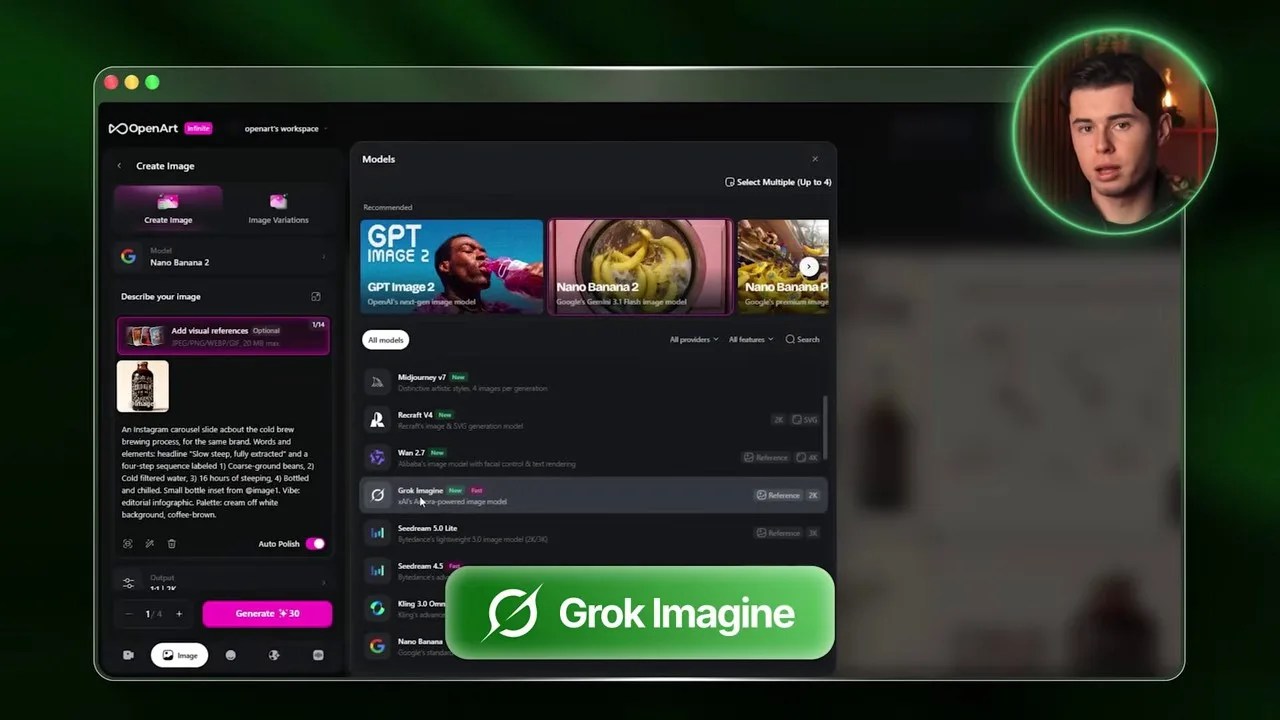
The Battlefield: Why OpenArt is the Perfect Testing Ground
To ensure this comparison remains 100% fair and unbiased, I avoided jumping between different web apps, Discord bots, or custom APIs. Instead, I used OpenArt, a highly versatile platform that aggregates all of these state-of-the-art models under one clean, unified interface.
OpenArt’s clean dashboard makes it incredibly simple to swap models on the fly while keeping settings identical.
Our goal for this test is highly practical: we are going to design a professional four-slide Instagram carousel. Why a carousel? Because whether you are a brand builder, a freelance graphic designer, or a content creator, carousels are the bread and butter of modern digital marketing. They require a delicate mix of product placement, textual clarity, visual hierarchy, and stylistic continuity—the ultimate stress test for any creative AI.
To keep the experiment scientifically controlled, we will feed all three models the exact same inputs: a single universal prompt structure and a shared visual reference image of our core product.
Step 1: Crafting the Anchor Product (The Coffee Brew Bottle)
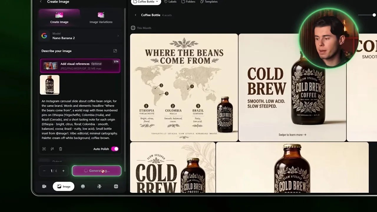
Before designing social media slides, we need an actual product to advertise. I decided to go with a premium cold brew coffee bottle. To generate our source-of-truth reference image, I booted up the image creation workspace on OpenArt, selected Google’s Nano Banana 2 as our starting engine, and dialed in the generation settings.

Setting our resolution to 2K and choosing Nano Banana 2 to kick off our product design.
I set the aspect ratio to a standard square, bumped the resolution up to a crisp 2K, and kept the generation count to one. The result? A remarkably clean, high-end cold brew bottle with elegant typography, a beautiful amber glass finish, and minimalist labeling.

Our anchor product: A stunning, photorealistic cold brew bottle that we will feed into all subsequent generations.
This image is now our creative anchor. By uploading this bottle as a visual reference on OpenArt, we can force GPT Image 2, Nano Banana 2, and Grok Imagine to maintain product consistency across all our carousel slides.
Slide 1 Clash: Premium Details vs. Boring Layouts
With our reference bottle locked in, it was time to generate the crucial first slide of our Instagram carousel. I started by switching the active model to OpenAI’s GPT Image 2, setting the quality to high, keeping the resolution at 2K, and maintaining a 1:1 aspect ratio to keep things perfectly fair.
Let’s look at how the three models handled the exact same prompt and visual reference for Slide 1.
GPT Image 2: The Premium Standard

GPT Image 2 absolutely nailed the editorial feel, adding organic leaves that perfectly mirror the bottle’s label art.
Honestly, this output from GPT Image 2 is breathtaking. It didn’t just slap the bottle onto a background; it understood the organic, high-end identity of the brand. It framed the bottle with delicate green leaves in the corners that match the botanical style of the label. The layout feels highly intentional, and the text rendering is flawless. Even the microscopic warning text at the very bottom of the bottle—”keep refrigerated” and “16 fluid ounces”—is perfectly legible. A few months ago, this level of text precision in AI art was completely unthinkable.
Nano Banana 2: Clean but Sterile

Nano Banana 2 delivered a sharp image, but the overall layout feels sterile and low-effort.
Next, I swapped the model to Google’s Nano Banana 2. While the image is undeniably crisp and the bottle itself looks fantastic, the overall composition feels incredibly flat. The “Cold Brew” header text lacks any organic texture or integration; it looks like basic, uninspired text you’d quickly throw together in Canva in thirty seconds. It lacks the premium, editorial soul that OpenAI brought to the table.
Grok Imagine: The Balanced Challenger

Grok Imagine balanced the layout beautifully, though it missed some of the premium organic details of GPT Image 2.
Finally, I ran the prompt through xAI’s Grok Imagine. I was pleasantly surprised by this one. Grok made a smart design choice by pushing the bottle to the right and placing the bold header on the left, creating a highly balanced, asymmetrical layout that naturally guides the eye. The typography rendering is solid and clean. However, it still missed those tiny, organic design details (like the framing leaves in GPT Image 2) that elevate a design from “good AI generation” to “professional studio design.”
The Blueprint: My Universal Prompt Framework for Flawless Layouts
You might be wondering: How did I get these models to output clean graphic layouts instead of chaotic, messy illustrations?
The secret isn’t just luck; it lies in a highly structured, professional prompt framework. If you want to understand how modern creators leverage the best AI tools for graphic design without losing their minds, you need to stop writing long, rambling paragraphs and start using a modular system.

The exact prompt framework I use to force AI models to generate clean, professional graphic layouts.
Here is the exact four-part blueprint I used for these generations:
- Slide Context: Start by defining the format and the brand context. (e.g., “An Instagram carousel slide about coffee bean origin…”). This instantly tells the model it is creating a graphic design layout, not a random painting.
- Elements & Copy: Explicitly state the text, copy, and specific visual items that must be present on the canvas.
- Mood: Set the stylistic tone. For this project, I used words like “editorial” and “minimalist cartography” to steer the AI away from cheap, cartoonish styles.
- Palette: Define your color constraints precisely. We specified a “cream off-white background with coffee brown accents” to guarantee brand harmony.
Now that we have our blueprint locked down, let’s put it to work for the second slide of our carousel. I switched the active engine back to OpenAI’s GPT Image 2, kept our previous rendering settings intact, and updated the prompt to focus on the origin of our coffee beans.
Slide 2: The Origin Story (Visual Mapping Showdown)
The goal for this slide was to show consumers exactly where their coffee beans come from in a way that feels organic, informative, and visually integrated with the brand.
GPT Image 2: A Masterclass in Vintage Editorial
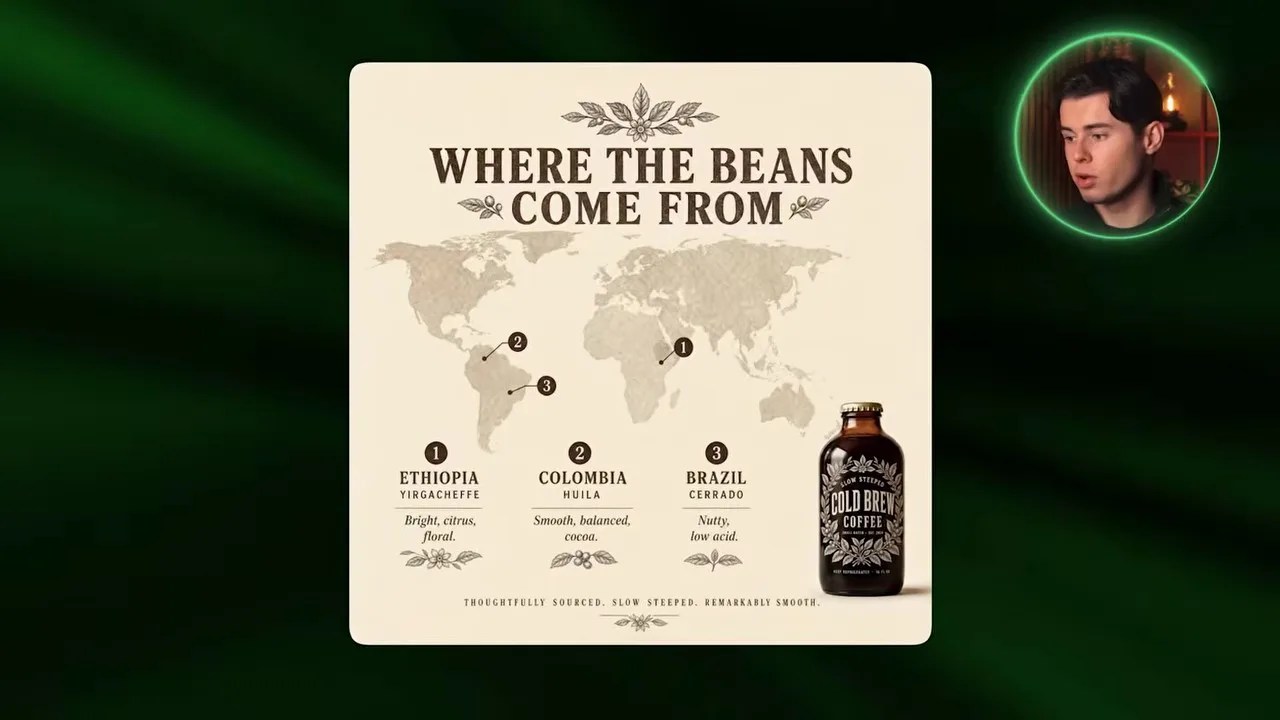
GPT Image 2 created a beautifully cohesive campaign slide with intricate, label-matching details.
Once again, GPT Image 2 delivered a stunning result. It didn’t just throw a generic map on the screen; it continued the vintage, premium aesthetic we established in Slide 1. The stylized cartography, the numbered origin points, and the delicate botanical illustrations feel like they were hand-drawn by the same designer who created the bottle label. It feels like a unified brand campaign, not a series of random, disconnected images.
Nano Banana 2: The PowerPoint Vibe
Nano Banana 2’s attempt looks more like a corporate presentation slide than a premium social media ad.
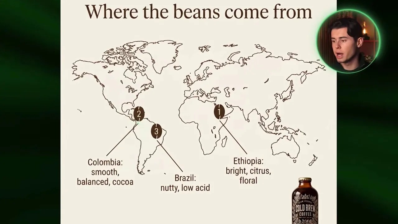
When we ran the exact same prompt through Google’s Nano Banana 2, the drop in design quality was immediately obvious. Yes, the map is clean, and yes, the origins are marked. But the layout feels incredibly dry—almost like a slide from a corporate PowerPoint deck rather than an engaging social media post. Worse, the reference bottle feels awkwardly pasted onto the bottom corner rather than being a natural, physical part of the scene.
Grok Imagine: Clean but Empty
Grok Imagine delivered a highly legible layout, but lacked the rich textures needed for a premium brand feel.
Grok Imagine took a middle-ground approach. It created a clean, modern layout with sharp lines pointing directly from the text to the map origins, making the information very easy to digest. However, the canvas feels empty. The bottle is too small, and the background lacks the rich, organic textures and decorative elements that made the GPT Image 2 output look so expensive.
Slide 3: Demystifying the Brewing Process
For the third slide, we wanted to illustrate the meticulous cold-brewing process. This is where many AI engines fail because they struggle to organize step-by-step information logically on a single canvas.
GPT Image 2: The Infographic Champion
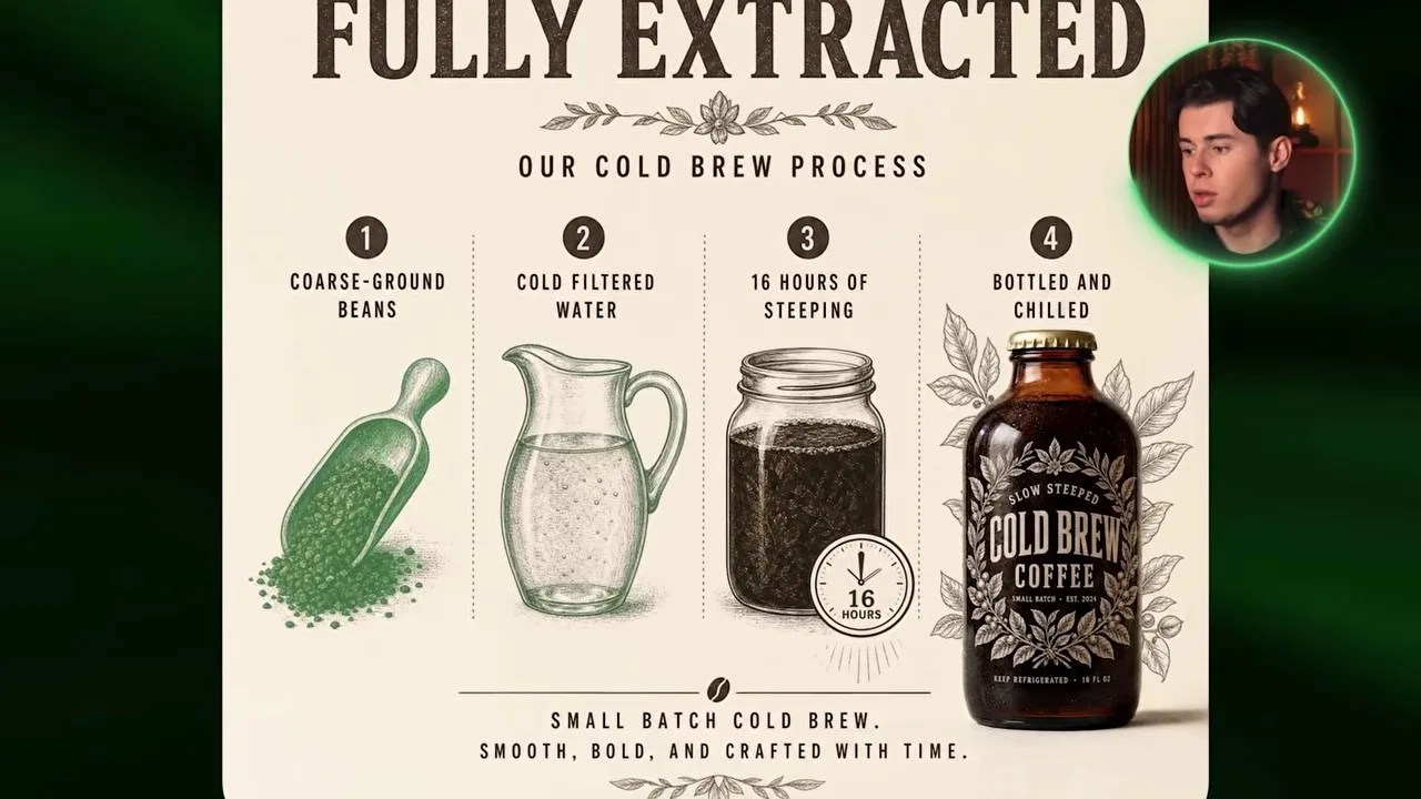
GPT Image 2 beautifully integrated detailed process illustrations with our product bottle.
GPT Image 2 blew me away here. It designed a highly polished, poster-style infographic. The brewing steps are clearly segmented, the illustrations are intricately detailed, and the bottle on the right is perfectly integrated into the composition. It looks like an authentic, old-school coffee company poster that you would actually want to hang on a wall.
Grok Imagine: Clear but Underwhelming
Grok Imagine’s layout is highly readable, but the product bottle feels like an afterthought.
Google’s Nano Banana 2 (not pictured) produced a flat, sterile diagram that looked like a basic restaurant menu. Grok Imagine, on the other hand, went for a much simpler, linear step-by-step layout. While the row of steps is incredibly clean and easy to follow, the final product bottle is far too small. It reads well, but it lacks the premium visual energy required to actually sell a high-end product.
Slide 4: The Final Pitch (Call to Action)
The final slide of any carousel has one job: get the user to take action. We prompted the models to create a compelling Call to Action (CTA) slide with our bottle as the hero element.
GPT Image 2: Ready for Production

GPT Image 2 created a highly realistic, warm lifestyle scene complete with a styled vintage button.
OpenAI’s model closed the design loop beautifully. It placed our cold brew bottle into a warm, realistic cafe setting. The lighting is rich, the product has a powerful physical presence, and the call-to-action button at the bottom is styled in the same vintage typography as the rest of the campaign. This is a design you could upload directly to your ad manager without any extra editing.
In comparison, Nano Banana 2 generated a generic social media template with no personality, while Grok Imagine delivered a beautiful lifestyle photo of coffee beans but completely forgot to style the actual CTA elements, making it feel like a stock photo rather than an ad slide.
The Verdict: Which of the Best AI Tools for Graphic Design Fits Your Budget?
Looking at the final carousel, you might think GPT Image 2 is the undisputed, hands-down winner. From a purely aesthetic and typographic standpoint, it absolutely is. But in the real world of creative production, we have to talk about the elephant in the room: cost efficiency.

The massive credit discrepancy between the models on OpenArt.
Take a close look at the data above. While GPT Image 2 delivers mind-blowing, agency-grade results, it costs a staggering 136 credits per generation on OpenArt. Meanwhile, Grok Imagine costs a mere 10 credits.
That is a massive 13.6x price difference. If you are in the initial brainstorming phase—testing different layouts, angles, and copy ideas—burning through 136 credits per click will drain your budget in minutes.
Because of this, my professional recommendation is to use a hybrid strategy:
- Use Grok Imagine (10 credits): For rapid prototyping, layout testing, and concept brainstorming. It is incredibly cheap, fast, and handles text remarkably well.
- Use GPT Image 2 (136 credits): Once you have locked in your visual direction and prompt structure, switch to OpenAI’s model to generate your final, high-resolution, pixel-perfect production assets.
Managing this workflow used to be a massive headache, requiring expensive monthly subscriptions to OpenAI, Google, and xAI simultaneously. By using OpenArt, you can access all of these powerful models under one single, affordable subscription. It gives you the ultimate creative flexibility to swap engines based on your budget and project needs, without the subscription fatigue.
Summary of the Creative Battle
This head-to-head battle proved that the landscape of AI graphic design has matured incredibly fast. We are no longer dealing with garbled text or abstract shapes. GPT Image 2 has set a new benchmark for premium, cohesive brand design, while Grok Imagine offers unparalleled bang-for-your-buck efficiency. By combining these tools strategically within a unified workspace like OpenArt, you can cut your design production time down to a fraction of what it used to be.
Frequently Asked Questions (FAQ)
Why is GPT Image 2 so much more expensive than Grok Imagine?
GPT Image 2 uses a significantly larger neural architecture optimized specifically for complex spatial layout, precise text rendering, and high-fidelity texture generation. This requires massive computational power, which translates to the higher credit cost on platforms like OpenArt. Grok Imagine is highly optimized for speed and cost-efficiency, making it perfect for rapid prototyping.
Can I use these generated designs directly for commercial client work?
Yes! Because these models now render text and product details with incredible accuracy, the outputs are highly usable. However, for high-end client work, we always recommend doing a final pass in a tool like Photoshop or Figma to fine-tune alignment, adjust vector logos, and ensure perfect brand guidelines.
How do I keep my product looking identical across all carousel slides?
The key is using a “visual reference” feature, which is built directly into OpenArt. By generating your core product first (like our coffee bottle), saving it, and uploading it as an image-to-image or visual style reference, you force the AI model to maintain the same bottle shapes, colors, and labels across different slide backgrounds.


